I have now used GMail quite a bit and must say the interface is really fantastic.
The keyboard orientated interface is for me the most appealing, combined with the searching and ease of filtering mails this is going to be my favorite means of reading mailing lists in the future.
Read the full article for some screenshots and description of some of the features I like most.
The first thing you see is the inbox view, here I cleared the inbox and you can see the unique Google fun type bits of text all over.
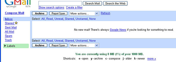
The labeling concept is something you just have to grow to like, I like deleting mail I get lots of bounces and so forth and this is something that isn’t easy in GMail, in fact they seem to discourage it with status messages after clearing your trash like “No conversations in the trash. Who needs to delete when you have 1000 MB of storage?!”. To delete a mail you need to move it to trash, go to the trash section and select the mails and then choose ‘Delete forever’.
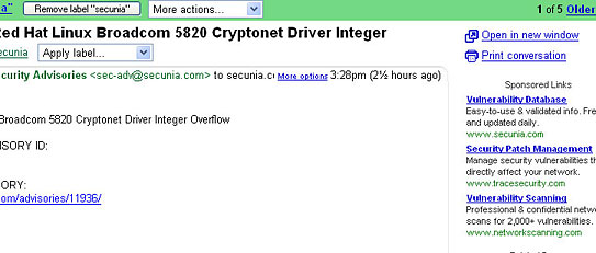
I think what everyone is worried about is the ads, below is a mail from Secunia about a vulnerability and the ads all are of interest and not in the way. If you have been using Google a lot you will not even notice them since you will have grown used to them. They are also not always there only sometimes, I guess only when it’s sure to give you relevant ads.
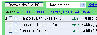
As far as usability goes, this is where things are really good. This morning I had some trouble going through 50 odd mails that were mostly junk, selecting them was a bit of a pain, I am sure I will find a easy way to do that as I use it some more. But for normal use it is great. The mailbox view is a typical view showing all your mail. It supports threading in a strange but nice way. In the image below the first 2 lines are 8 mails grouped in ‘conversations’. You can either go point and click on a conversation to open it, or use the “j” and “k” buttons to move the pointer up and down, hitting enter on your message will open the conversation.
I opened the 2nd conversation and used my “p” and “n” keys to move around the list of messages, the oldest unread mail will be the one that’s displayed, if nothing is unread the last one gets shown. In the conversation view you can jump between different conversations without going back to the mailbox view by simply using the “j” and “k” buttons – same one to move up and down in a list view.
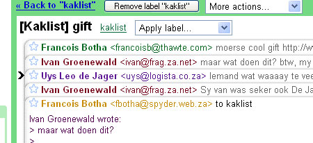
Hitting enter on the selected message in the thread opens it without closing any others, enter again to close it, this is very nice for scrolling around a long thread. Also note below it hides quoted text automatically clicking on the hotlink will show the quoted text this is very nice indeed.
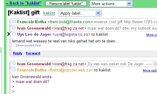
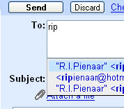
To respond to any email there are a number of hotkeys, one for a simple reply, one for reply to all and one for forwarding. In each case it has full lookup ability against your address book. And any email you send to gets added to the address book automatically. Use the normal up and down arrows to select an address or keep typing to narrow down the address book search.
So far pretty much everything you have seen here was done using just the keyboard, one thing you cannot do with the keyboard though is select to view a labeled group of mails. The thing with labels are that one email can have multiple labels. In the example below the whole conversation has 2 labels associated with it, and I can see the conversation in either the “All Mail” view, the “Avi” group or the “hive” group. The label concept also goes into the search function where you can search for things like “label:secunia redhat” to find the mail shown in the ads example above.

Will fill in some more later on, but the whole thing just oozes simplicity and it really is refreshing not to see banner adds but rather the much less distracting text ads. Though the ease of ignoring them may be their downfall, Google has announced they are going into the banner ad business soon.

